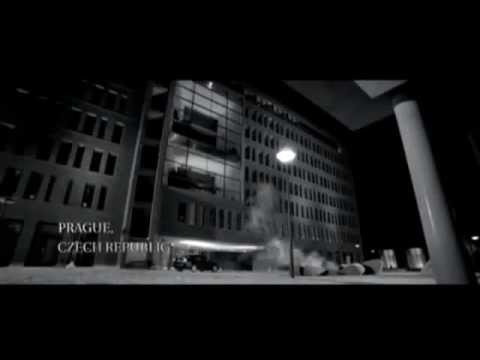
Immediately, the audience is thrown into curiosity as to why it is in black and white. It would be assumed that it is because it is a past event, but with flashbacks breaking the scene up as well it creates a large back story for the reader and makes them want to watch more because they have a greater understanding of past events. This gives a greater understanding going forward, but still develops an enigma as not everything is revealed. The scene shows Bond killing two people and it also shows the location through an establishing shot, but it does not tell the audience who, when or why. This encourages the viewer to continue watching as they are immediately intrigued.

Low angled shots are common in this sequence as it gives status to the character and also makes them feel anxiety. Bond, being the hero, creates a calmer feel, making the audience feel rescued. However this is put into jeopardy when the villain opens his drawer to show a gun, making it seem as though Bond is in danger. However this roller coaster of emotions is finished off by Bond revealing that he had emptied it prior to his arrival, subsequently pulling his own gun on him.
The eerie music and setting contribute the building of anxiety. It is then interrupted by dramatic music over the fight scene as it is meant to build adrenaline. Then going back to the eerie music gives perspective of how Bond is handling the situation. In addition to this there is diagetic sound of
footsteps that indicate to the audience that the building could be very quiet or even empty. This increases the suspense.
The difference in costume contributes to the scenes well - in the scene that causes anticipation Bond is dressed in dark clothes to seem mysterious, whereas in the scene that is meant to build adrenaline Bond is dressed very scruffy to show intensity. The difference in editing techniques work well as they help create a mood. The scene in the office features less cuts than the fight sequence as the director is trying to convey a relaxed but creepy mood, whereas the fight seen is all about energy and intensity, helped by the excessive use of cuts, but in the office sequence it is only s shot reverse shot.

.jpg)
.jpg)
.jpg)
More detail needed in camerawork here. Use terms, and explain how specific camera techniques contribute to the thriller mood. Try to write more.
ReplyDeleteThe website is looking bit flashy and it catches the visitors eyes. Design is pretty simple and a good user friendly interface. สมัครts911
ReplyDeleteGreat knowledge, do anyone mind merely reference back to it doglotto
ReplyDeleteNice post mate, keep up the great work, just shared this with my friendz slotbunny168.com
ReplyDeleteNice post! This is a very nice blog that I will definitively come back to more times this year! Thanks for informative post. 5G999
ReplyDeleteThe content is utmost interesting! I have completely enjoyed reading your points and have come to the conclusion that you are right about many of them. You are great, and your efforts are outstanding! เว็บบาคาร่า
ReplyDeleteThis is very interesting content! I have thoroughly enjoyed reading your points and have come to the conclusion that you are right about many of them. You are great. เกมยิงปลา
ReplyDelete